IU Gateway
iu.edu is Indiana University's (IU) system-wide gateway website where prospective students and their parents can go to find information about any of IU’s nine campuses.
Visit site →This site's main audience is prospective students and their parents. It was built to them quickly and easily find important information about tuition rates, application processes, and admissions standards.
The problem
The previous iteration of iu.edu was mostly being used as a news and PR site with minimal information about the system of IU campuses. This made it difficult for prospective students to find important information about admissions standards, life on campus, and tuition fees without having to move between several different sites.
In the spring of 2020 facing uncertainty about how the new COVID-19 pandemic might affect enrollment, leadership made the decision to re-imagine iu.edu as a new gateway site where students and their parents could get the important they needed all in one place.
My Role
I worked as the lead of a cross-functional team of designers and developers that worked with the university's principal information architect (IA) and a small team content strategists consultants we hired from the digital agency Brain Traffic. In addition to acting as the design and development team lead, I was the primary UI/UX designer on the project.
Project kick-off
By the time my team started on the project the IA and content strategy team had conducted an extensive content audit, interviewed subject matter experts, created a site map, and delivered page tables for the majority of the site.
In addition designing components and screens for new content, my team was responsible for figuring out how to pull together additional data from external sources including a university-wide degrees and majors database and the university newsroom. Finally, we were also tasked with figuring out how to reuse and deliver the site's informational content to the newly launched IU Mobile app.
Process
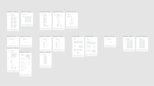
First, my team worked with the content strategist to create wireframes based on the page tables they supplied.

For the wireframes we focused on a small modular set of design patterns that could be mixed and matched throughout the site. This made it easier for us quickly iterate on designs for the different page templates and layouts.
At the same time wireframes were being created, the development team worked to first create a proxy data store we could use to aggregate data from external systems and feed it to our new site via a consistent application programming interface (API)
Deliverables
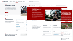
With wireframes in place, I created a set of high fidelity visual design mockups for each of the main page types on the site. In addition to finalizing the visual design before developer hand-off, the UI mockups also gave our team the opportunity to pilot new component and patterns for the next version of our design system.

Results
In the months after the new gateway launch, the analytics team saw a 110% increase in organic search traffic. The newly designed site and content strategy also led to a 124% increase in referrals to the main IU admissions website.
Impact
After launch the team I led was partially dissolved to move on to work on other COVID-19 response projects. That included me going back to resume work on version two of [our design system Rivet](link to Rivet case study). The team that took over the design and development continued to build on the design styles and patterns we established, including consolidating the main university COVID-19 information site in the new gateway.
Lessons learned
This was a potentially high impact project with an objectively compressed timeline. On top of that the whole team was learning how to live through a global health emergency. I learned that if you put the right team together, you can still get a lot done in a small amount of time while still doing your best to take care of your mental and physical health.